Work Project — 2025-2026 — Partially Released

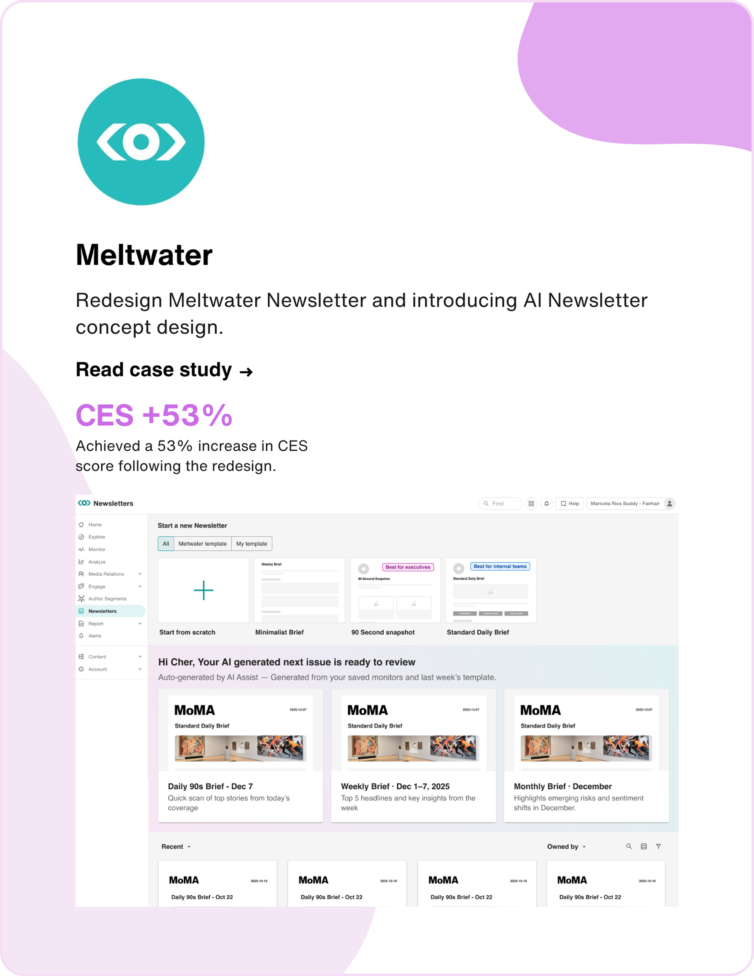
Redesigning Newsletter for the AI Era

As the lead product designer, I redefined Newsletter from a static reporting tool into an engagement infrastructure — transforming a 46-step workflow into an AI-powered experience and driving a 53% CES improvement.

53%
CES Improvement
50%
Steps Reduced
4
AI Features
Newsletter Redesign Preview
My Role
Senior Product Designer
Team
Product Manager (1)
Developer Team (4)
User Researcher (1)
Type
Work Project (Partially Released)
Timeline
Q4 2025 – Q1 2026
Understand Meltwater Newsletter

Meltwater is a global leader in media intelligence, serving 30,000+ companies with media monitoring, social listening, and PR analytics. Newsletter is one of its most-used features — the primary way PR teams deliver curated media updates to stakeholders. Originally a static reporting tool, I reframed it as an engagement infrastructure — enabling scalable creation, intelligent prioritization, and faster decisions.

"Newsletter" ≠ Newsletter

"Newsletter" = Media monitoring roundup

Understanding the User

Through FullStory session analysis, user interviews, and journey mapping, I identified the core pain points driving user frustration.

Customer Journey Map

Customer Journey Map

User Need Statement

I am A PR / communications professional responsible for keeping executives and stakeholders informed with regular media monitoring updates
I'm trying to Quickly put together polished, branded updates that highlight the most relevant stories — and get them out on a consistent schedule
But Every newsletter takes too long to create. I get lost choosing templates, buried in settings, and end up manually arranging content every single time
Because The tool asks me to make too many decisions upfront, doesn't remember my preferences, and gives me no help prioritizing what matters most
Which makes me feel Like I'm spending more time fighting the tool than doing my actual job
Three Core Pain Points

Overwhelming Workflow

→ 46 Steps to Send

Creating a single newsletter required navigating 46 steps across multiple screens — selecting templates, configuring settings, adding content, and scheduling — with no shortcuts or automation.

Cognitive Overload

→ Confusing Choices

Unclear template differences, deeply nested settings, and too many upfront decisions made it hard for users to get started and stay focused on what matters.

No Intelligence

→ Manual Everything

Users had to manually sort, prioritize, and curate every piece of content with no smart suggestions, no summaries, and no way to learn from past newsletters.

"How might we redesign the newsletter experience to reduce complexity, surface the most relevant content intelligently, and let PR professionals go from intent to send with minimal effort?"

From Ideas to Action

After identifying the three pain points, I facilitated brainstorming sessions with the team to generate solutions, then prioritized them using an Impact/Effort matrix.

Brainstorming Ideas

AI Sort
AI Summary
AI branding
Prepopulated NL
Flatten workflow
Use-case templates
Image resizing
Drag and drop
Use-case content settings
Data dashboard
Recipients list

AI Features Workflow & UX

Impact / Effort Matrix

← Low    Impact    High →
Flatten workflow
Use-case templates
Prepopulated NL
AI branding
Big Bets
AI Sort
AI Summary
Quick Wins
Fill-ins
Use-case content settings
Money Pit
Image resizing
Data dashboard
Recipients list
Drag & drop
← Low    Effort    High →
Four-Phase Roadmap

Based on the research findings, I proposed an AI-first strategy — adding intelligence while simultaneously simplifying the experience.

System Layer
Intelligence
Embed AI to assist decisions
System Layer
Workflow
Flatten steps, reduce friction
System Layer
Architecture
Modular, persona-driven structure
System Layer
Full Shift
All layers converge
In Research
Phase 3
Refinement
📋

Use-Case Driven

AI branding & simpler customization

Redesign templates around PR use cases. AI-generate layouts from company branding and simplify customization — reducing cognitive load and cold-start friction.

In Research
Phase 4
Full Autopilot
🚀

Prepopulated NL

Review, approve, send

AI learns from user preferences and AI Sort data to auto-generate complete newsletters. Users just review, approve, and hit send.

AI Sort & AI Summary

First, I introduced AI features to solve the biggest pain: users manually sorting and reading every article. AI Sort and AI Summary were shipped alongside the workflow redesign.

AI Sort

Automatically rank and prioritize content by relevance and importance, so the most critical stories surface first.

  • Smart ranking based on brand relevance
  • Competitor mention prioritization
  • Sentiment-weighted ordering
  • One-click reorder with manual override

AI Summary

Generate concise summaries at three levels of granularity to save time for both creators and recipients.

  • Full newsletter executive summary
  • Section-level highlights
  • Individual article key takeaways
  • Customizable tone and length
Flatten the Workflow

Flattened the 46-step workflow into 23 steps — putting template, content, settings, and preview all on one page so users never have to navigate back and forth.

Three Design Challenges

Improvement 1: Unified Content & Template Settings

Previously, content settings and content selection lived on separate pages, forcing users to jump back and forth. Now they're merged into one place — users can configure template and content simultaneously without navigating away.

Merged content settings panel Inline content source selector Real-time preview sync
Before
Before: Separate Content Settings
After
After: Unified Content Settings
9 of 10 users
successfully found and adjusted content settings without leaving the page in usability testing.

Improvement 2: In-Page Preview

Users no longer need to reach the final step of the flow and then navigate back to make changes. The preview now lives on the same page — reducing clicks and eliminating unnecessary loading time.

Live preview panel Eliminated back-navigation Instant layout feedback
Before
Before: Preview at end of flow
After
After: In-page preview
100% backtracking eliminated
All 10 users completed the preview-to-send flow without backtracking. The back button was removed entirely — preview now lives on the same page, so there's no step to go back to.

Improvement 3: Visualized "Add Elements"

The old "Add Elements" panel was a wall of text labels, making it hard to understand what each element looked like. The redesign uses visual previews for every element, so users can see exactly what they're adding at a glance.

Visual element thumbnails Categorized element grid Drag-to-add interaction
Before
Before: Text-only Add Elements
After
After: Visual Add Elements
10 of 10 users
correctly identified and added the right element type on first try, compared to 5 of 10 with the text-only list.
Use-Case Driven

Templates redesigned around specific PR use cases with AI branding and simplified customization. Currently conducting iterative user research to validate and refine.

Three use-case personas

Use-Case Driven Templates

Replaced generic templates with three purpose-built layouts — 90-Second Snapshot, Standard Daily Brief, and Crisis Brief — so users start with a structure that matches their goal.

Before
Before: Generic Templates
After
After: Use-Case Driven

Simplified Content Settings

Replaced manual, one-by-one content configuration with pre-set content layouts. Each layout comes with content settings already configured — so users pick a layout and everything is set up automatically, instead of adjusting each setting by hand.

Before
Before: Content Settings
After
After: Content Settings

Auto Brand & Logo

AI automatically applies company logo, brand colors, and fonts to templates — eliminating manual branding setup and the cold-start problem for new users.

Before
Your Company Name
March 20, 2026
Manual setup required — no brand colors or logo
After
After: Auto Brand & Logo
Prepopulated Newsletter

The ultimate vision: AI learns from user behavior to auto-generate complete newsletters. Users shift from creators to editors — just review, tweak, and send.

How It Works

AI analyzes past newsletters, AI Sort rankings, and user edits to understand preferences — then auto-generates a ready-to-send draft.

  • Learns from historical content selections
  • Adapts to AI Sort ranking patterns
  • Auto-populates layout, content, and summaries
  • Improves with every user edit

User Experience

Instead of building from scratch, users open a pre-built newsletter and focus on what matters — reviewing and approving content.

  • Open → Review → Approve → Send
  • Override any AI decision with one click
  • Full control with zero setup effort
  • Estimated time savings: 70%+
Manual Sorting
AI Sort & Summary
Flatten Workflow
Full Auto-Generation
Measurable Results
53%
Customer Effort Score Improvement
46 → 23
50% Steps Reduced
54 → 82
CES Score (53% lift)
4
AI Features Designed
From Reporting Tool to Engagement Infrastructure

The Newsletter had been treated as a static reporting surface. I redefined it as a high-frequency engagement infrastructure — a system designed to drive intelligent decision-making and retention.

How I Got There
01

Discover

FullStory analysis, user interviews, journey mapping, competitive audit

02

Define

Persona creation, problem framing, pain point prioritization, HMW statements

03

Ideate

Brainstorming sessions, impact/effort prioritization, design strategy roadmap

04

Design

Wireframing, prototyping, use-case mapping, design system integration

05

Deliver

Dev handoff, QA, CES tracking, iterative refinement across 3 phases

What I Learned

What Went Well

  • Phased delivery — shipping AI Sort first built stakeholder trust and gave us real data to inform the bigger workflow redesign.
  • Cross-functional alignment — early involvement of engineering in brainstorming prevented scope creep and ensured feasibility.
  • Data-driven decisions — FullStory + CES metrics made it easy to justify design changes and measure impact.

What I'd Do Differently

  • Prototyping with V0 — I used V0 to build a functional prototype with real interactions, which helped me test the actual product experience rather than relying on static mockups alone.
  • More user segments — our testing skewed toward power users. Including first-time users earlier would have caught onboarding gaps sooner.
  • Document decisions faster — some design rationale was lost between iterations. A lightweight decision log would have helped with handoff.
Explore Other Projects